. Kept in sync with the live Elementor global header widget (kasturi-header-widget.html); if that widget changes, mirror the change here too. *//* ================================================
BLOCK: HERO — dark gradient + animated canvas
================================================ */
.hero{background:linear-gradient(135deg,var(--electric) 0%,var(--royal-core) 45%,var(--midnight) 100%);min-height:100dvh;display:flex;align-items:center;padding:72px 0 72px;overflow:hidden;position:relative}
.hero::before{content:'';position:absolute;width:600px;height:600px;background:radial-gradient(circle,rgba(28,77,214,0.35) 0%,transparent 70%);top:-100px;right:-100px;pointer-events:none}
.hero::after{content:'';position:absolute;width:400px;height:400px;border:1px solid rgba(255,255,255,0.05);border-radius:50%;bottom:-80px;left:5%;pointer-events:none}
#heroCanvas{position:absolute;inset:0;width:100%;height:100%;z-index:1;pointer-events:none}
.hero-inner{display:grid;grid-template-columns:1fr 420px;gap:48px;align-items:center;position:relative;z-index:2}
.hero-text{}
.hero h1{font-family:var(--font-display);font-size:clamp(36px,5.2vw,64px);font-weight:700;line-height:1.06;letter-spacing:-0.01em;color:var(--white);margin-bottom:20px}
.hero h1 em{font-style:italic;color:rgba(255,255,255,0.88)}
.hero-sub{font-size:clamp(15px,1.3vw,17px);font-weight:300;color:rgba(255,255,255,0.72);max-width:44ch;line-height:1.7;margin-bottom:32px}
.hero-actions{display:flex;align-items:center;gap:12px;flex-wrap:wrap;margin-bottom:36px}
.hero-certifications{display:flex;align-items:center;gap:10px;flex-wrap:wrap}
.cert-chip{display:inline-flex;background:rgba(255,255,255,0.1);border:1px solid rgba(255,255,255,0.18);border-radius:999px;padding:5px 14px;font-size:12px;font-weight:500;color:rgba(255,255,255,0.8);letter-spacing:0.02em}
.hero-card{background:rgba(5,15,55,0.75);backdrop-filter:blur(20px) saturate(160%);border:1px solid rgba(255,255,255,0.12);border-radius:20px;padding:32px 28px;display:flex;flex-direction:column;gap:16px}
.hero-card h3{font-family:var(--font-display);font-size:20px;font-weight:700;color:var(--white);line-height:1.25}
.hero-card p{font-size:14px;color:rgba(255,255,255,0.6);line-height:1.6}
.hero-card-actions{display:flex;flex-direction:column;gap:10px}
.hero-card-actions .btn{width:100%;justify-content:center}/* ================================================
BLOCK: CATEGORY STRIP (4-up)
================================================ */
.category-strip{padding:56px 0;background:var(--surface-tint);border-bottom:1px solid var(--border)}
.cat-grid{display:grid;grid-template-columns:repeat(4,1fr);gap:16px}
.cat-card{background:var(--white);border-radius:var(--radius);padding:24px;border:1px solid var(--border);display:flex;flex-direction:column;gap:12px;transition:transform .3s var(--glide),box-shadow .3s var(--glide),border-color .3s}
.cat-card:hover{transform:translateY(-4px);box-shadow:var(--shadow-soft);border-color:var(--accent)}
.cat-icon{width:100%;height:150px;border-radius:10px;overflow:hidden;background:#eef0ff;flex-shrink:0;display:flex;align-items:center;justify-content:center;font-family:var(--font-display);font-weight:700;font-size:15px;color:var(--ink-blue)}
.cat-icon img{width:100%;height:100%;object-fit:cover}
.cat-card h3{font-family:var(--font-display);font-size:18px;font-weight:700;color:var(--ink-blue)}
.cat-card p{font-size:14px;color:var(--text-2);line-height:1.5;flex:1}
.cat-link{font-size:13px;font-weight:600;color:var(--accent);display:flex;align-items:center;gap:4px}/* ================================================
SECTIONS GENERAL
================================================ */
.section{padding:88px 0}
.section-alt{background:var(--surface-tint)}
.section-dark{background:linear-gradient(135deg,var(--royal-core),var(--midnight));color:var(--white)}
.section-dark .section-head h2{color:var(--white)}
.section-dark .section-head p{color:rgba(255,255,255,0.65)}/* ================================================
BLOCK: ROOM / PRODUCT-SCALE TABS + PRODUCT CARDS
================================================ */
.room-tabs{display:flex;gap:8px;flex-wrap:wrap;margin-bottom:40px}
.room-tab{padding:10px 20px;border-radius:999px;border:1.5px solid var(--border);background:var(--white);font-size:14px;font-weight:500;color:var(--text-2);cursor:pointer;transition:all .22s;white-space:nowrap}
.room-tab.active,.room-tab:hover{background:var(--ink-blue);color:var(--white);border-color:var(--ink-blue)}
.room-panel{display:none}
.room-panel.active{display:grid;grid-template-columns:repeat(3,1fr);gap:20px}
.product-card{background:var(--white);border-radius:var(--radius);border:1px solid var(--border);overflow:hidden;transition:transform .35s var(--glide),box-shadow .35s var(--glide),border-color .3s}
.product-card:hover{transform:translateY(-6px);box-shadow:var(--shadow-soft);border-color:var(--accent)}
.product-card-img{aspect-ratio:16/10;background:linear-gradient(135deg,#f0f4ff,#e8eeff);display:flex;align-items:center;justify-content:center;position:relative;overflow:hidden;font-family:var(--font-display);font-weight:700;font-size:26px;color:var(--ink-blue)}
.product-card-img img{width:100%;height:100%;object-fit:cover}
.product-badge{position:absolute;top:12px;right:12px;background:var(--accent);color:var(--white);font-size:10px;font-weight:700;letter-spacing:0.1em;text-transform:uppercase;padding:4px 10px;border-radius:999px}
.product-card-body{padding:20px 22px 22px}
.product-card-body h3{font-family:var(--font-display);font-size:18px;font-weight:700;color:var(--ink-blue);margin-bottom:6px}
.product-card-body .model{font-size:11px;font-weight:600;letter-spacing:0.1em;text-transform:uppercase;color:var(--text-3);margin-bottom:10px}
.product-card-body p{font-size:14px;color:var(--text-2);line-height:1.55;margin-bottom:16px}
.product-specs{display:flex;flex-wrap:wrap;gap:6px;margin-bottom:18px}
.spec-chip{background:var(--surface-tint);border:1px solid var(--border);border-radius:999px;font-size:12px;font-weight:500;color:var(--text-2);padding:3px 10px}
.product-card-action{display:flex;align-items:center;justify-content:space-between}
.product-card-action a{font-size:13px;font-weight:600;color:var(--accent);display:flex;align-items:center;gap:4px}/* Feature card grid (3-up) — reused for accessories */
.headset-grid{display:grid;grid-template-columns:repeat(3,1fr);gap:20px}
.headset-card{background:var(--white);border-radius:var(--radius);border:1px solid var(--border);padding:24px;transition:transform .35s var(--glide),box-shadow .35s var(--glide),border-color .3s;display:flex;flex-direction:column;gap:12px}
.headset-card:hover{transform:translateY(-4px);box-shadow:var(--shadow-soft);border-color:var(--accent)}
.headset-tag{display:inline-flex;align-items:center;gap:5px;background:var(--surface-tint);border:1px solid var(--border);border-radius:999px;padding:3px 10px;font-size:11px;font-weight:600;color:var(--text-2);text-transform:uppercase;letter-spacing:0.08em;width:fit-content}
.headset-card h3{font-family:var(--font-display);font-size:17px;font-weight:700;color:var(--ink-blue)}
.headset-card p{font-size:14px;color:var(--text-2);line-height:1.55;flex:1}
.headset-features{list-style:none;display:flex;flex-direction:column;gap:5px}
.headset-features li{font-size:13px;color:var(--text-2);display:flex;align-items:flex-start;gap:7px}
.headset-features li::before{content:'';width:6px;height:6px;border-radius:50%;background:var(--accent);flex-shrink:0;margin-top:6px}
.headset-mark{width:100%;height:150px;border-radius:8px;background:linear-gradient(135deg,#eef1ff,#e2e8ff);display:flex;align-items:center;justify-content:center;font-family:var(--font-display);font-weight:700;font-size:13px;color:var(--ink-blue);text-align:center;padding:16px;overflow:hidden}
.headset-mark img{width:100%;height:100%;object-fit:contain}/* ================================================
BLOCK: SOFTWARE / PLATFORM GRID (dark section)
================================================ */
.software-grid{display:grid;grid-template-columns:repeat(2,1fr);gap:24px}
.software-card{background:rgba(255,255,255,0.06);border:1px solid rgba(255,255,255,0.1);border-radius:var(--radius);padding:28px;transition:background .3s,border-color .3s}
.software-card:hover{background:rgba(255,255,255,0.1);border-color:rgba(255,255,255,0.2)}
.software-card h3{font-family:var(--font-display);font-size:20px;font-weight:700;color:var(--white);margin-bottom:10px}
.software-card p{font-size:14px;color:rgba(255,255,255,0.65);line-height:1.6}/* ================================================
BLOCK: CERTIFICATIONS BAR (text pills, not icons)
================================================ */
.certs-bar{padding:44px 0;border-top:1px solid var(--border);border-bottom:1px solid var(--border)}
.certs-inner{display:flex;align-items:center;justify-content:center;gap:14px;flex-wrap:wrap}
.cert-item{font-size:13px;font-weight:600;color:var(--text-2);background:var(--surface-tint);border:1px solid var(--border);border-radius:999px;padding:8px 18px;display:inline-block;transition:border-color .2s,color .2s,background .2s}
a.cert-item{cursor:pointer}
a.cert-item:hover{border-color:var(--accent);color:var(--ink-blue);background:var(--white)}/* ================================================
BLOCK: FAQ — pill design
================================================ */
.faq-list{max-width:840px;margin:0 auto;display:flex;flex-direction:column;gap:14px}
.faq-item{border:1.5px solid var(--border);border-radius:999px;overflow:hidden;background:var(--white);transition:border-radius .3s var(--glide),border-color .3s,box-shadow .3s}
.faq-item.open{border-radius:28px;border-color:var(--accent);box-shadow:var(--shadow-soft)}
.faq-q{display:flex;justify-content:space-between;align-items:center;width:100%;box-sizing:border-box;text-align:left;padding:19px 22px 19px 28px;cursor:pointer;gap:20px;background:transparent;border:none;font:inherit;white-space:normal;transition:background .2s}
.faq-q:hover{background:var(--surface-tint)}
.faq-q h3{flex:1;min-width:0;font-size:16px;font-weight:500;color:var(--ink-blue);line-height:1.45;white-space:normal;overflow-wrap:break-word;word-break:break-word}
.faq-icon{flex-shrink:0;width:30px;height:30px;margin-left:4px;border-radius:50%;border:1.5px solid var(--border);display:flex;align-items:center;justify-content:center;transition:background .25s,border-color .25s,transform .3s}
.faq-icon svg{width:14px;height:14px;stroke:var(--text-3);transition:stroke .25s}
.faq-item.open .faq-icon{background:var(--accent);border-color:var(--accent);transform:rotate(45deg)}
.faq-item.open .faq-icon svg{stroke:var(--white)}
.faq-a{max-height:0;overflow:hidden;transition:max-height .4s ease}
.faq-a-inner{padding:2px 28px 22px;font-size:15px;color:var(--text-2);line-height:1.7}
.faq-item.open .faq-a{max-height:400px}
@media(max-width:640px){
.faq-q{padding:16px 18px 16px 20px;gap:14px}
.faq-q h3{font-size:15px}
.faq-a-inner{padding:2px 20px 18px}
}/* ================================================
BLOCK: CTA BAND
================================================ */
.cta-band{background:linear-gradient(135deg,var(--electric),var(--midnight));padding:88px 0;text-align:center}
.cta-band h2{font-family:var(--font-display);font-size:clamp(28px,4vw,44px);font-weight:700;color:var(--white);margin-bottom:16px}
.cta-band p{font-size:17px;font-weight:300;color:rgba(255,255,255,0.72);max-width:48ch;margin:0 auto 36px}
.cta-actions{display:flex;align-items:center;justify-content:center;gap:14px;flex-wrap:wrap}/* FOOTER — see the .kas-foot-root footer block near the end of. Kept in sync with kasturi-footer-widget.html. *//* ================================================
BLOCK: ANSWER-FIRST (AEO) BOX + COMPARE TABLE
================================================ */
.answer-first{padding:36px 0;background:#fff;border-bottom:1px solid var(--border)}
.answer-box{display:grid;grid-template-columns:auto 1fr;gap:0;border:1px solid var(--border);border-radius:var(--radius);overflow:hidden;width:100%}
.answer-q-col{background:var(--midnight);padding:24px 20px;display:flex;align-items:flex-start;gap:10px;min-width:200px;max-width:260px}
.answer-q-label{width:28px;height:28px;border-radius:50%;background:rgba(255,255,255,0.12);display:flex;align-items:center;justify-content:center;font-size:13px;font-weight:700;color:#fff;flex-shrink:0}
.answer-q-text{font-size:13px;font-weight:500;color:rgba(255,255,255,0.82);line-height:1.55}
.answer-a-col{padding:24px 28px;background:var(--surface-tint);display:flex;align-items:flex-start;gap:12px}
.answer-a-label{width:28px;height:28px;border-radius:50%;background:var(--accent);display:flex;align-items:center;justify-content:center;font-size:13px;font-weight:700;color:#fff;flex-shrink:0;margin-top:1px}
.answer-a-text{font-size:14px;color:var(--ink);line-height:1.7}
.answer-a-text strong{font-weight:600;color:var(--ink-blue)}
.compare-table{width:100%;margin:24px 0 0;border-collapse:collapse;font-size:14px}
.table-scroll{overflow-x:auto}
.compare-table th{text-align:left;font-size:11px;font-weight:700;letter-spacing:0.08em;text-transform:uppercase;color:var(--text-3);padding:0 16px 10px;border-bottom:2px solid var(--border)}
.compare-table td{padding:14px 16px;border-bottom:1px solid var(--border);color:var(--text-2);vertical-align:top}
.compare-table td:first-child{font-family:var(--font-display);font-weight:700;color:var(--ink-blue);white-space:nowrap}
.compare-table tr:last-child td{border-bottom:none}
@media(max-width:640px){.compare-table{font-size:13px}.compare-table th,.compare-table td{padding:10px 8px}}/* ================================================
BLOCK: STORE SECTION
================================================ */
.store-section{padding:64px 0 72px;background:#f4f5f9}
.store-head{display:flex;align-items:flex-end;justify-content:space-between;margin-bottom:28px;flex-wrap:wrap;gap:16px}
.store-body{display:block}
.store-grid{display:grid;grid-template-columns:repeat(4,1fr);gap:18px}
.store-card{background:#fff;border:1px solid var(--border);border-radius:var(--radius);overflow:hidden;display:flex;flex-direction:column;transition:transform .3s var(--glide),box-shadow .3s var(--glide),border-color .3s}
.store-card:hover{transform:translateY(-5px);box-shadow:var(--shadow-soft);border-color:rgba(21,56,194,0.25)}
.store-card-img{position:relative;background:#f5f6ff;height:190px;display:flex;align-items:center;justify-content:center;flex-shrink:0;font-family:var(--font-display);font-weight:700;font-size:22px;color:var(--ink-blue);overflow:hidden}
.store-card-img img{width:100%;height:100%;object-fit:cover}
.store-badge{position:absolute;top:10px;left:10px;font-size:10px;font-weight:700;letter-spacing:0.07em;text-transform:uppercase;border-radius:999px;padding:3px 10px;color:#fff;line-height:1.6}
.store-badge.popular{background:#16a34a}
.store-badge.new-badge{background:var(--midnight)}
.store-card-body{padding:15px 16px 18px;flex:1;display:flex;flex-direction:column}
.store-brand{font-size:10px;font-weight:700;letter-spacing:0.14em;text-transform:uppercase;color:var(--accent);margin-bottom:5px}
.store-card-body h3{font-family:var(--font-body);font-size:14px;font-weight:700;color:var(--ink-blue);margin-bottom:6px;line-height:1.35}
.store-card-body p{font-size:12.5px;color:var(--text-2);line-height:1.5;flex:1;margin-bottom:14px}
.store-card-btn{display:inline-flex;align-items:center;justify-content:center;background:var(--ink-blue);color:#fff;border-radius:999px;padding:9px 18px;font-size:13px;font-weight:600;font-family:var(--font-body);transition:background .2s,transform .2s var(--glide)}
.store-card-btn:hover{background:var(--electric);transform:translateY(-1px)}
.store-cta-row{text-align:center;margin-top:40px;padding-top:32px;border-top:1px solid var(--border)}
.store-cta-row p{font-size:14px;color:var(--text-2);margin-bottom:16px}
@media(max-width:1024px){
.store-grid{grid-template-columns:repeat(2,1fr)}
.answer-box{grid-template-columns:1fr}
.answer-q-col{max-width:100%;min-width:auto}
}
@media(max-width:767px){
.store-grid{grid-template-columns:1fr}
.store-head{flex-direction:column;align-items:flex-start}
}/* ================================================
RESPONSIVE
================================================ */
@media(max-width:1024px){
.cat-grid{grid-template-columns:repeat(2,1fr)}
.room-panel.active{grid-template-columns:repeat(2,1fr)}
.headset-grid{grid-template-columns:repeat(2,1fr)}
.hero-inner{grid-template-columns:1fr;gap:40px;max-width:600px}
}
@media(max-width:767px){
.hero{padding:56px 0 56px}
.section{padding:60px 0}
.cat-grid{grid-template-columns:1fr}
.room-panel.active{grid-template-columns:1fr}
.headset-grid{grid-template-columns:1fr}
.software-grid{grid-template-columns:1fr}
.hero-actions{flex-direction:column;align-items:flex-start}
.room-tabs{gap:6px}
.room-tab{font-size:12px;padding:8px 14px}
.certs-inner{gap:24px}
.cta-actions{flex-direction:column;align-items:center}
}
Kasturi Technology, Authorised Samsung Reseller
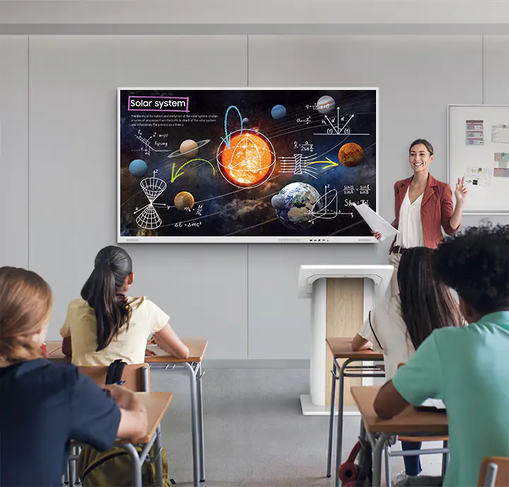
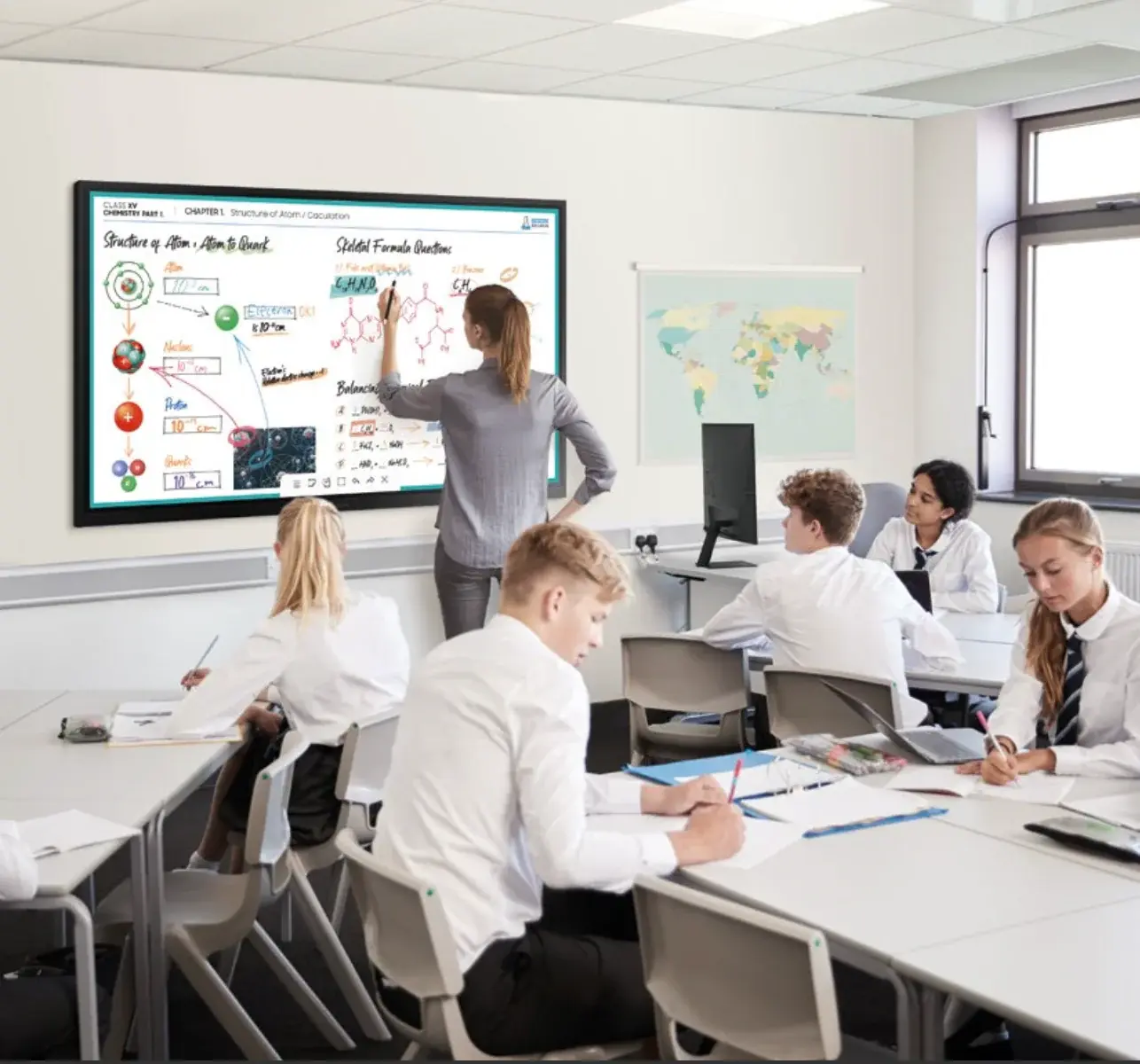
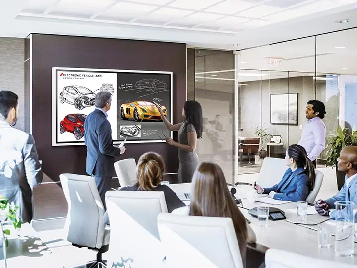
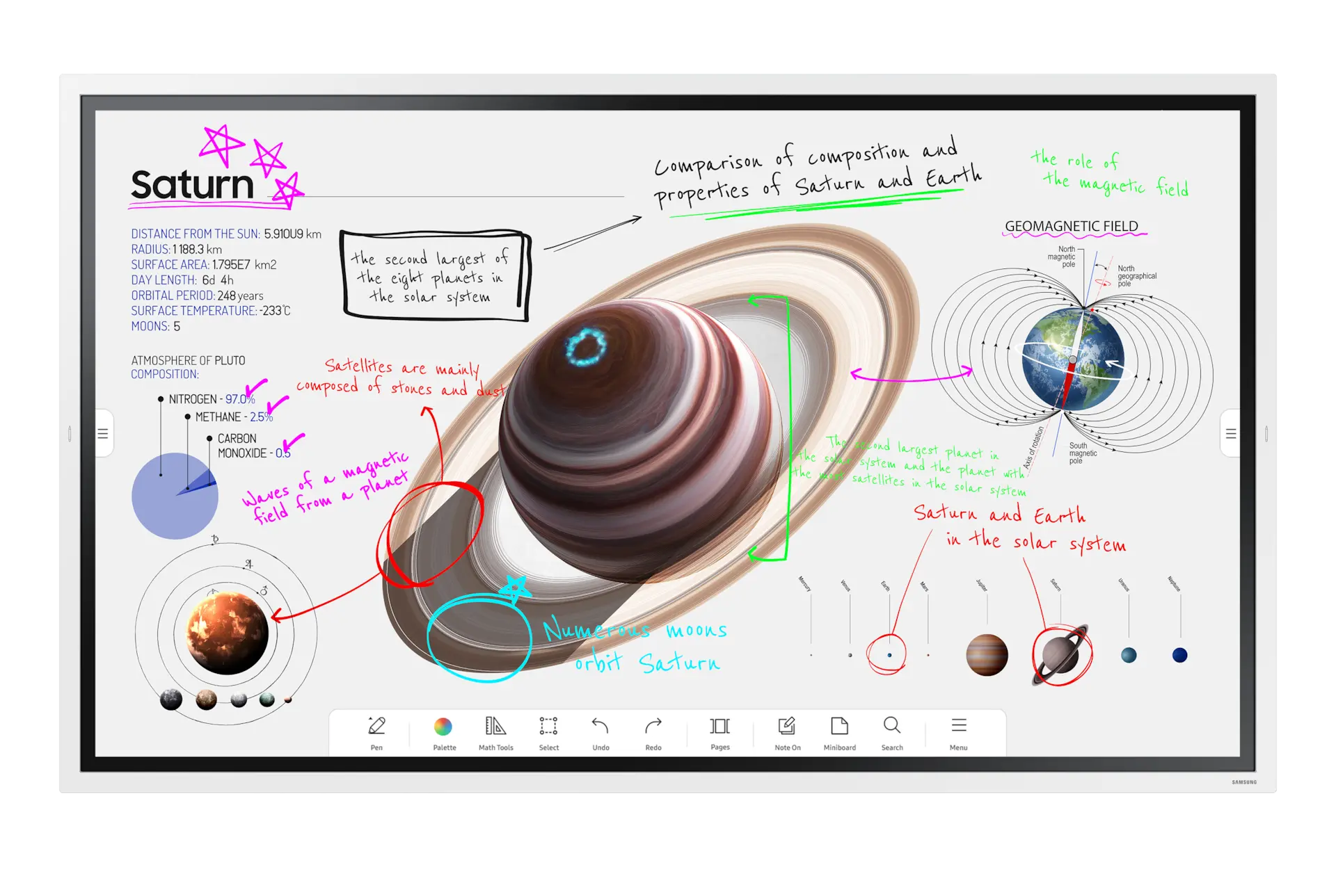
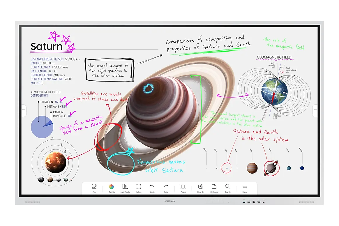
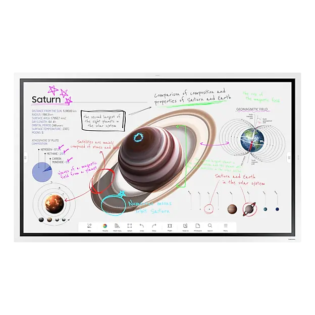
Samsung Flip Pro interactive displays for Malaysian classrooms and meeting rooms.Touch, teach and collaborate on one screen. The Samsung Flip Pro turns any wall into a UHD 4K, 20-point multi-touch whiteboard, built for hybrid classrooms and modern meeting rooms alike. We design, supply and install it across Malaysia.
Supply & Installation
Classroom & Meeting Room Setup
Samsung Authorised Reseller
Talk to a specialist today Tell us your room size and how you plan to use it. We will recommend the right Flip Pro size and send you a tailored quote in Malaysian Ringgit.
Q
Where can I buy a Samsung Flip Pro interactive display in Malaysia?
A
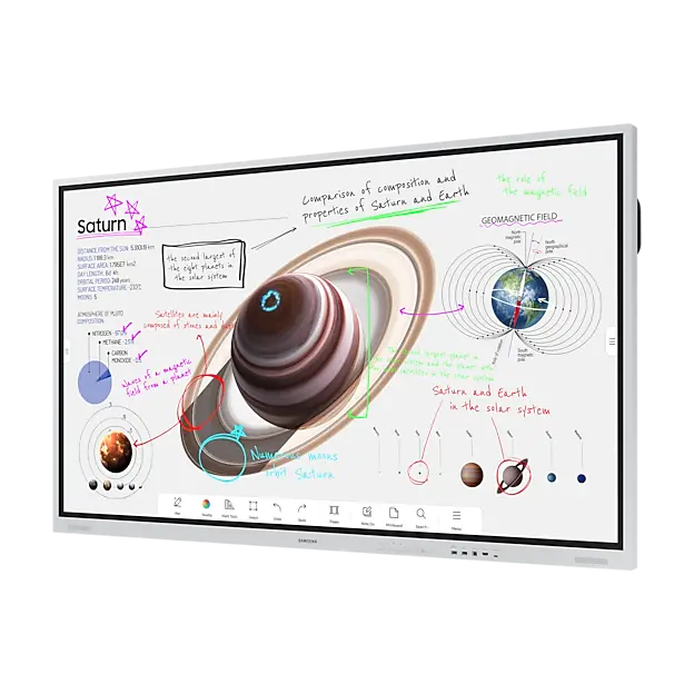
Kasturi Technology supplies the full Samsung Flip Pro (WMB Series) range in Malaysia, available in 55 inch (WM55B) , 65 inch (WM65B) , 75 inch (WM75B) and 85 inch (WM85B) sizes. Every model runs UHD 4K resolution with 20-point multi-touch , and ships with Samsung Knox security and MagicINFO remote device management built in. Kasturi provides supply, installation and post-sale support across Malaysia.
Showing 4 featured Samsung Flip Pro models . Samsung Flip Pro is quote-only, priced per project based on size, mounting and accessories.
55″
Samsung
Flip Pro WM55B 55 inch UHD display, 20-point touch, 2.0Ch 20W speakers, 32GB storage on Tizen 6.5.
Get a Quote
Popular
Samsung
Flip Pro WM65B 65 inch UHD display, 20-point touch, 2.0Ch 20W speakers, 32GB storage on Tizen 6.5.
Get a Quote
75″
Samsung
Flip Pro WM75B 75 inch UHD display, 20-point touch, 4.0Ch 40W front and rear speakers, 32GB storage.
Get a Quote
85″
Samsung
Flip Pro WM85B 85 inch UHD display, 20-point touch, 4.0Ch 40W front and rear speakers, 32GB storage.
Get a Quote Showing 4 featured products. Full Samsung Flip Pro catalogue available on request, plus Infinity Pro and video wall solutions.
Request a Full Catalogue Find the Right Fit
One display line, every room size All four Flip Pro sizes share the same UHD resolution, touch technology and software. Pick the size that matches your room and audience.
Huddle Rooms & Small Classrooms
Meeting Rooms & Standard Classrooms
Boardrooms, Lecture Halls & Auditoriums
Samsung Flip Pro WM55B
The compact choice for small rooms A 55 inch UHD panel with 20-point touch and 2.0Ch 20W rear speakers, sized for huddle rooms and small classrooms where every seat is close to the screen.
55 inch UHD
20-point touch
32GB storage
Samsung Flip Pro WM65B
The most popular size for everyday rooms A 65 inch UHD panel with 20-point touch and 2.0Ch 20W rear speakers, the balanced choice for standard meeting rooms and classrooms with 10 to 20 people.
65 inch UHD
20-point touch
32GB storage
Samsung Flip Pro WM75B
Built for rooms viewed from further back A 75 inch UHD panel with 20-point touch and 4.0Ch 40W front and rear speakers, for boardrooms and lecture halls with 20 to 40 people.
75 inch UHD
20-point touch
40W audio
Samsung Flip Pro WM85B
The largest Flip Pro, for the largest rooms An 85 inch UHD panel with 20-point touch and 4.0Ch 40W front and rear speakers, for auditoriums and large training centres.
85 inch UHD
20-point touch
40W audio
Mounting & Accessories
Mounted, moved or wired in, your way Kasturi fits the Flip Pro to how the room actually gets used, whether that means a fixed wall install or a display that rolls between rooms.
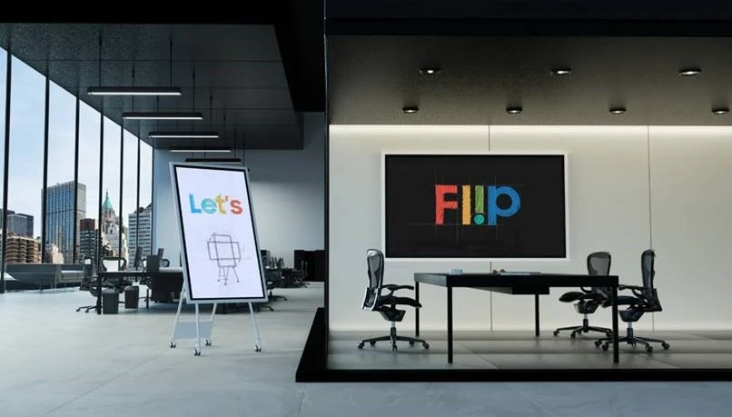
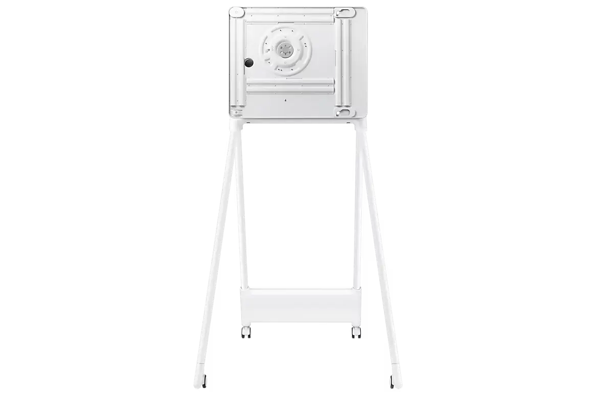
Mobile Stand Portable Stand A wheeled floor stand that lets the Flip Pro move between classrooms or meeting rooms as needed, no fixed installation required.
Height adjustable for standing or seated use Locking castors for safe transport
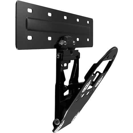
Fixed Install Wall Mount A fixed wall mount for rooms where the Flip Pro stays in one place permanently, installed and levelled by Kasturi's technicians.
Low-profile mount, flush to the wall Rated for the full Flip Pro weight range
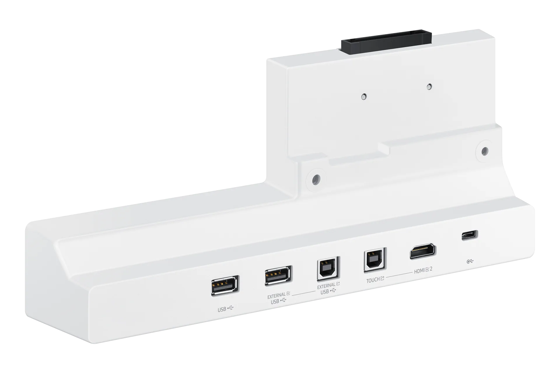
Cabling Connectivity Tray A rear connectivity tray that tidies HDMI, USB and power cabling behind the display, keeping the front of the room clean.
Routes cables away from the touch surface Simplifies future re-cabling or upgrades Device Software
What runs on the screen, out of the box The Flip Pro is a computer as much as a display. Every model ships with the same software layer, ready to teach, present or manage remotely.
Boxlight MimioConnect Pre-built lesson content and interactive teaching tools designed for the classroom, ready to use on day one without extra setup.
Workspace with Samsung Knox Securely access cloud drives, remote desktops and enterprise apps directly from the display, protected by Samsung Knox security.
Video Conferencing App Compatibility Run supported video conferencing apps directly on the Flip Pro, turning it into a meeting endpoint for hybrid teams and remote classes.
MagicINFO Remote Management Centrally manage, monitor and update every Flip Pro on the network from one dashboard, built for schools and offices with multiple displays.
Built in
Samsung Knox Security
Tizen 6.5 Operating System
UL2282 Antimicrobial Certified
SmartView+ (50 Devices)
32GB Storage Common Questions
Questions we get before every project
What sizes does the Samsung Flip Pro come in?
The Samsung Flip Pro is available in four sizes in Malaysia: 55 inch (WM55B), 65 inch (WM65B), 75 inch (WM75B) and 85 inch (WM85B). All four run the same UHD 4K resolution and 20-point multi-touch panel, so the choice comes down to room size, not display quality.
What makes the Samsung Flip Pro different from a regular interactive whiteboard?
The Flip Pro is a full UHD 4K touch display, not a projector and board combination. It runs Samsung's Tizen 6.5 operating system with 32GB of built in storage, so it can run apps, browse the web and manage content on its own, without a connected computer. It also ships with Samsung Knox security and MagicINFO remote device management for centralised control.
Is the Samsung Flip Pro suitable for meeting rooms, or only classrooms?
Both. The Flip Pro was designed with education in mind and ships with Boxlight MimioConnect lesson content built in, but it is equally at home in a boardroom or training room. It supports video conferencing apps, USB-C connection to laptops with 65W power delivery, and SmartView+ wireless sharing for up to 50 devices, which covers most corporate meeting needs.
What ports and connectivity does the Samsung Flip Pro support?
Every Flip Pro model has 2 HDMI ports, 1 DisplayPort, 3 USB ports and 1 USB-C port with 65W power delivery, plus 2 touch-out connections for extending the touch signal to a second display. SmartView+ adds wireless screen sharing for up to 50 devices without any cables.
Does Kasturi Technology install the Samsung Flip Pro?
Yes. Kasturi Technology supplies, mounts and installs the Samsung Flip Pro on either the portable stand or a fixed wall mount, sets up the network and remote management, and provides after-sales support across Malaysia.
How much does a Samsung Flip Pro cost in Malaysia?
Samsung Flip Pro is a quote-only product, priced per project based on the screen size, mounting option and any accessories or software add-ons. Contact Kasturi Technology with your room size and use case for a tailored quotation in Malaysian Ringgit.
Get in Touch
Ready to bring Samsung Flip Pro into your room? Tell us your room size and use case, and we will recommend the right model and send a tailored quote in Malaysian Ringgit. No obligation.